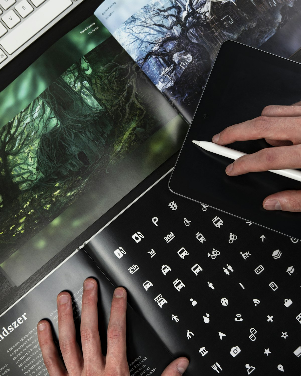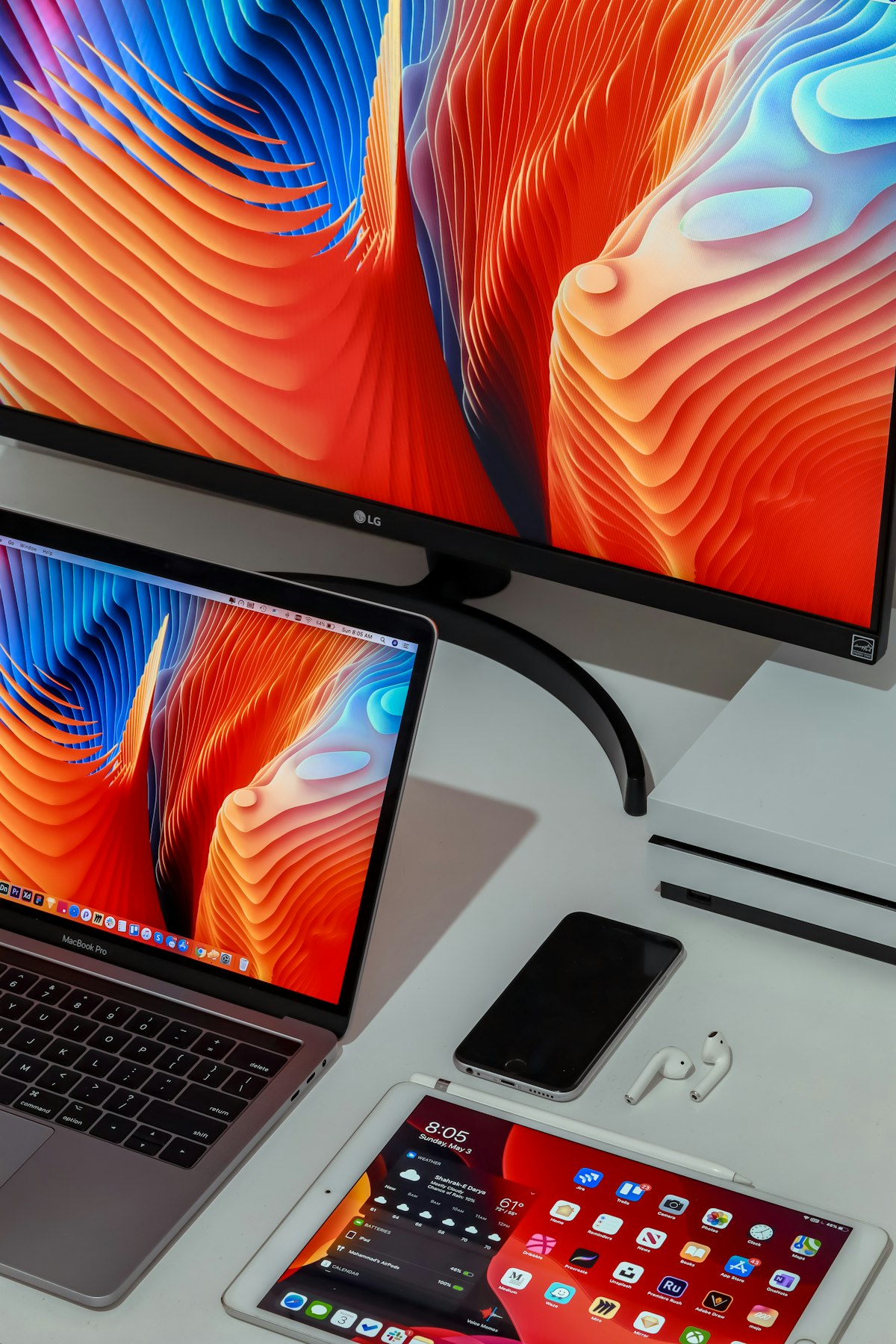
Mobile-first design was a revolution. It forced designers to prioritize, to focus on essential content, to stop building desktop experiences and hoping they'd shrink. But somewhere along the way, "mobile-first" became "mobile-only" — and that's a problem.
The Multi-Screen Reality
Your visitors use phones, tablets, laptops, desktops, and increasingly, large displays. Each device has different capabilities, different contexts, and different user expectations. Designing for only one is designing for only part of your audience.
Phones are for quick tasks, scanning, and on-the-go browsing. Content should be scannable, tap targets large, and forms minimal.
Tablets are for reading, browsing, and casual shopping. They're held closer than laptops, so text can be slightly smaller but touch targets remain important.
Laptops and desktops are for deep work, comparison, and tasks that benefit from a larger viewport. This is where you can use space generously, show more content simultaneously, and enable more complex interactions.
The Common Mistakes
Designing desktop as an afterthought. Many sites look great on mobile and broken on desktop — text stretched edge to edge across a 27-inch monitor, images blown up beyond their resolution, navigation that works on touch but fails with a mouse.
Ignoring large screens. As monitors grow, content that's centered in a 1200px container leaves huge empty margins. Consider a max-width that respects readability and use the surrounding space intentionally.
Forgetting the keyboard. Not everyone navigates with a mouse or a finger. Keyboard navigation, focus states, and accessibility matter on every screen.
The Right Approach
Start mobile-first — define the essential content and hierarchy. Then progressively enhance for larger screens: add columns, increase whitespace, reveal secondary content, and refine interactions. Test on real devices, not just browser dev tools.
Designing for every screen isn't about making things "responsive." It's about making things appropriate for each context. A phone experience and a desktop experience can — and should — feel like different products that serve the same purpose.